Airline Branding
Overview
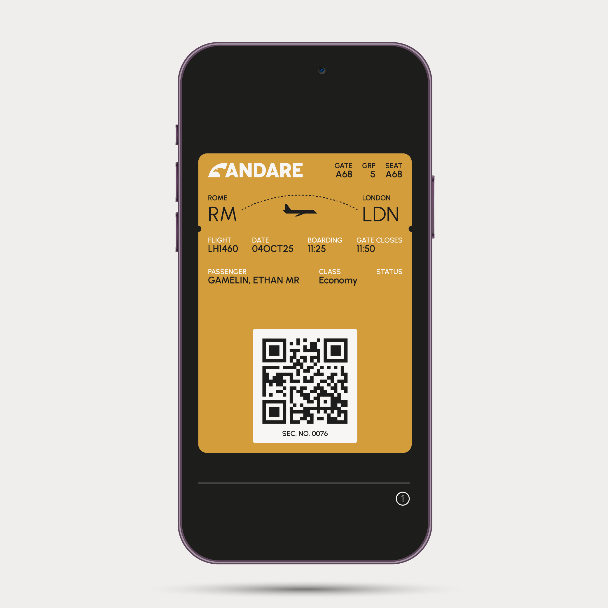
This was a project I did while I studied abroad in Copenhagen. The project focused on developing the brand identity of an airline we created. The deliverables included in the assignment were an airplane livery, branding guidelines, an in-flight magazine, travel posters, a digital boarding pass, and a marketing campaign.
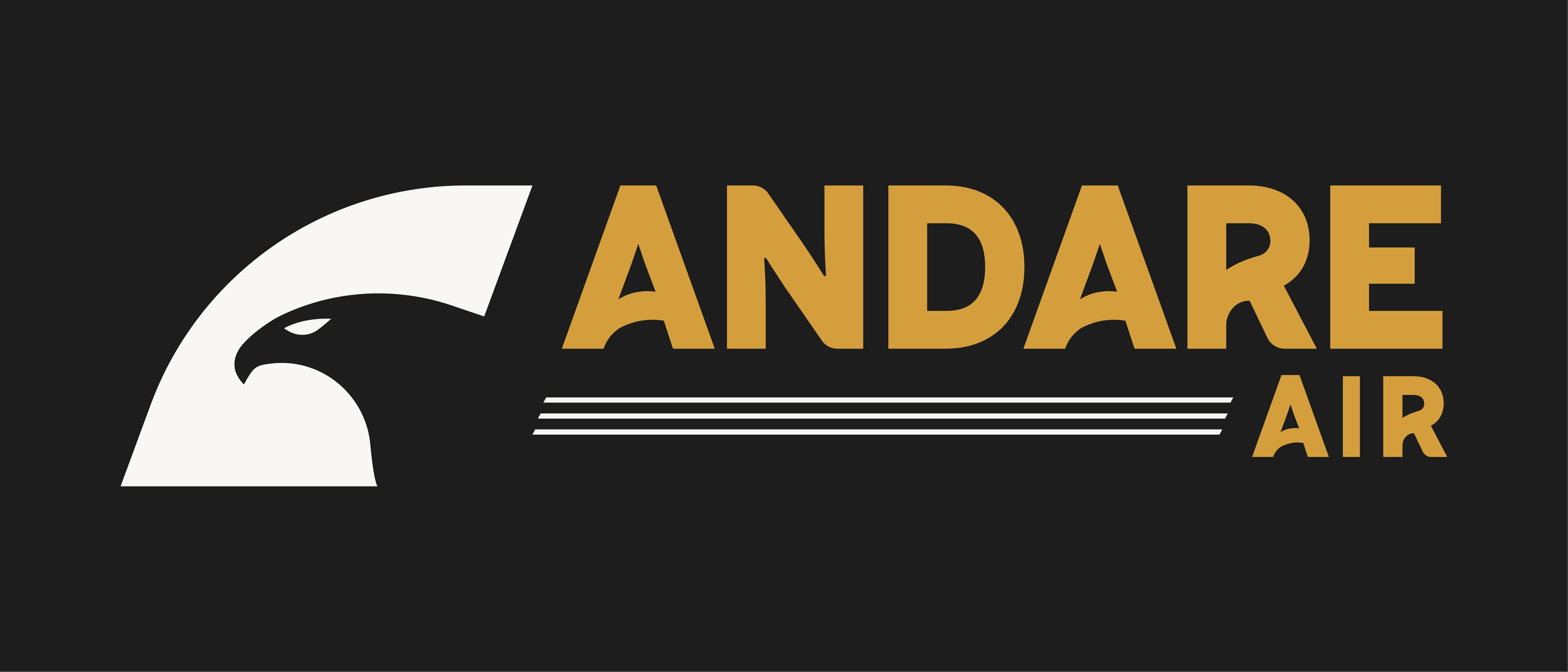
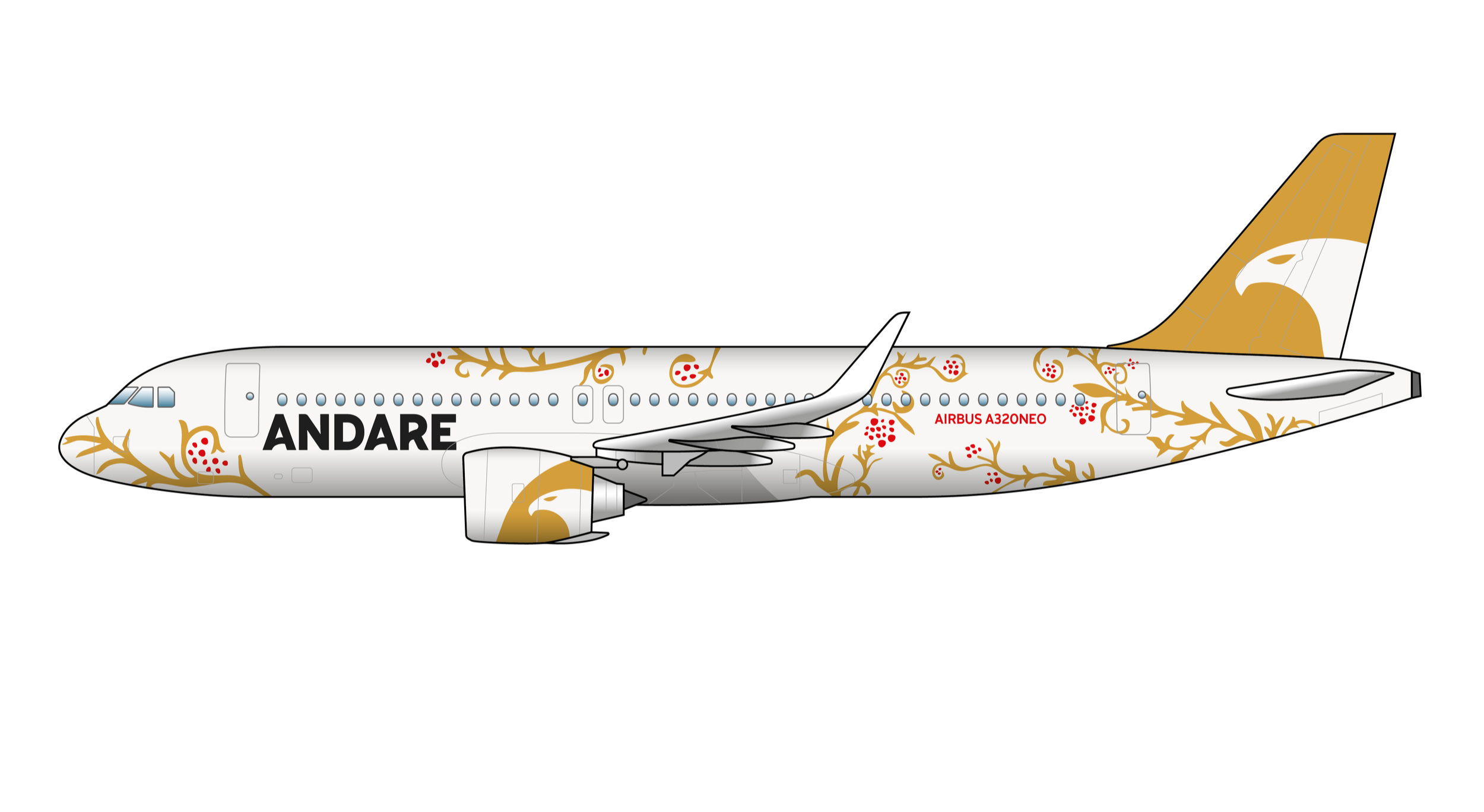
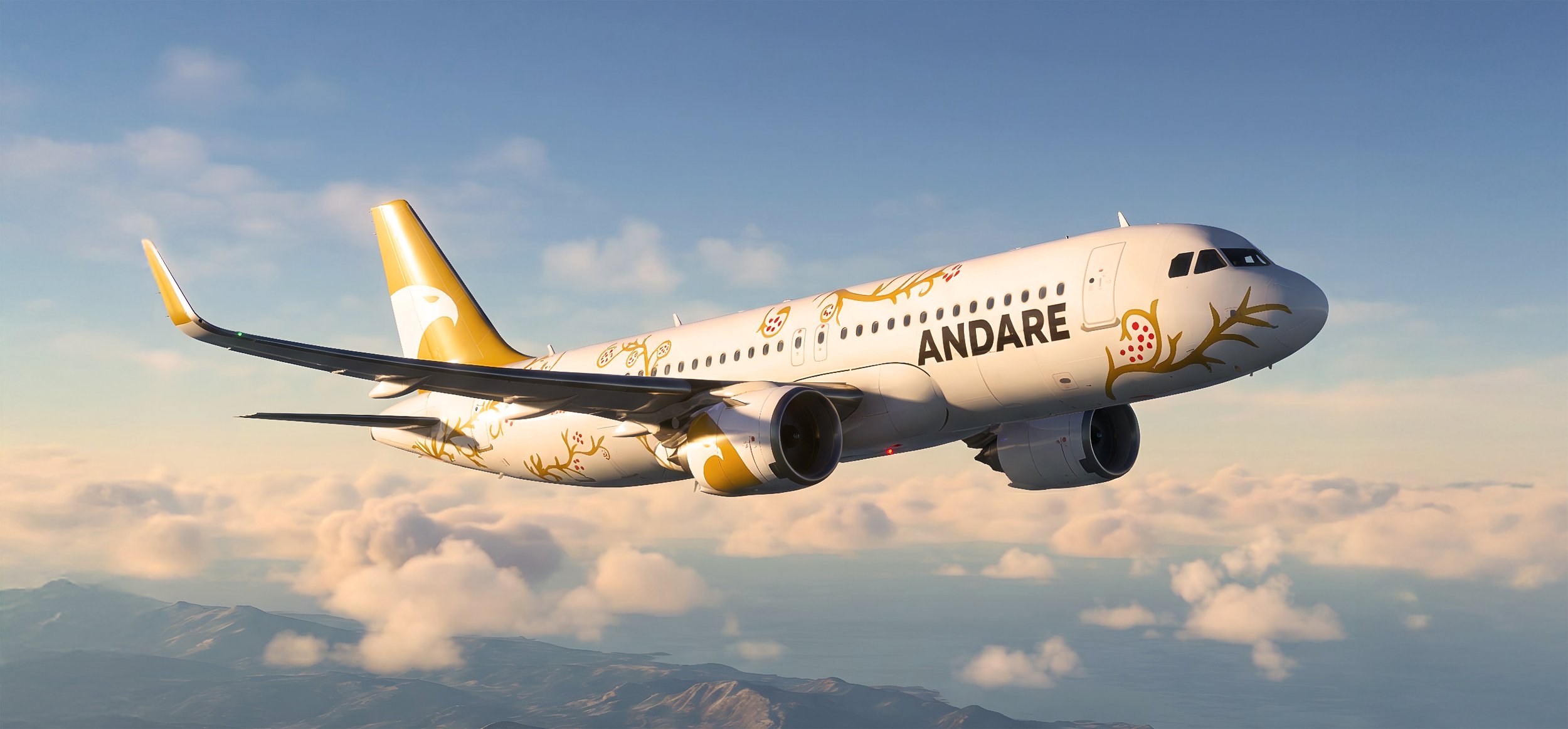
The name of my airline is called Andare Air, which is an Italian verb meaning, to go. I wanted my airline to feel high-class, balancing modern elements with traditional Italian art. The brand's visual identity took inspiration from the Roman Empire, such as racing chariots, pottery, and architecture. The airline's colors, ornamentation, and other elements are symbolic of Italian culture. The logo represents the Golden Eagle that lives in Italy and is cherished by locals.
-
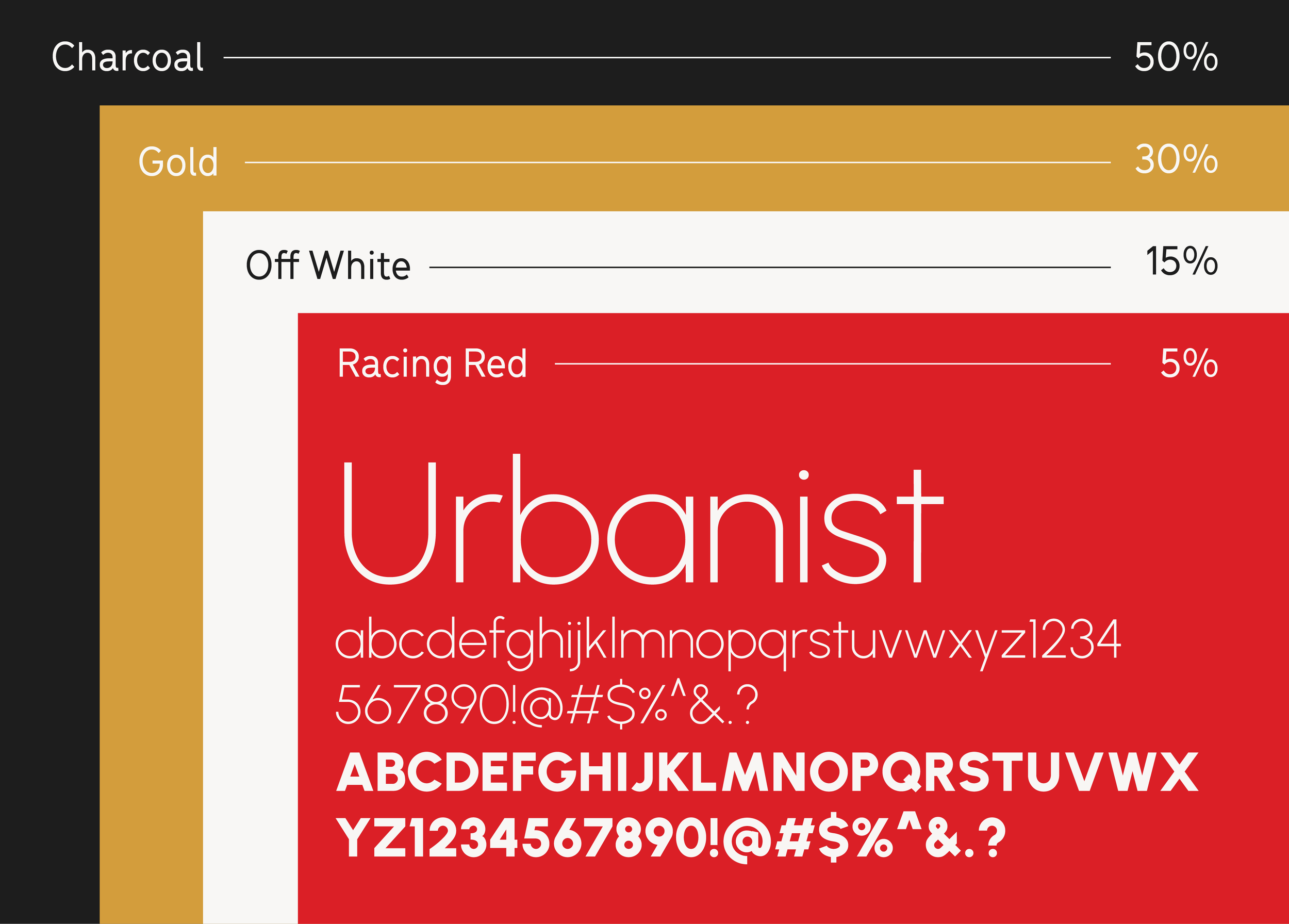
In my research around different airlines, I noticed that every logo included some insinuation of motion. I wanted the branding to feel distinct, bold, and classy. I wanted to create very modern elements with clean curves and geometric shapes.
The colors I landed on were influenced by old Roman design. The red is pulled directly from royal racing chariots, and the gold represents the prestige and high-class feel of the airline.
-
Throughout my sketching, I constantly referred to other airline liveries, looking at how the design flowed across the plane.
The ornamentation I incorporated into the airplane's design is inspired by Roman Architecture. I looked at racing chariots, columns, and interior architecture.
-
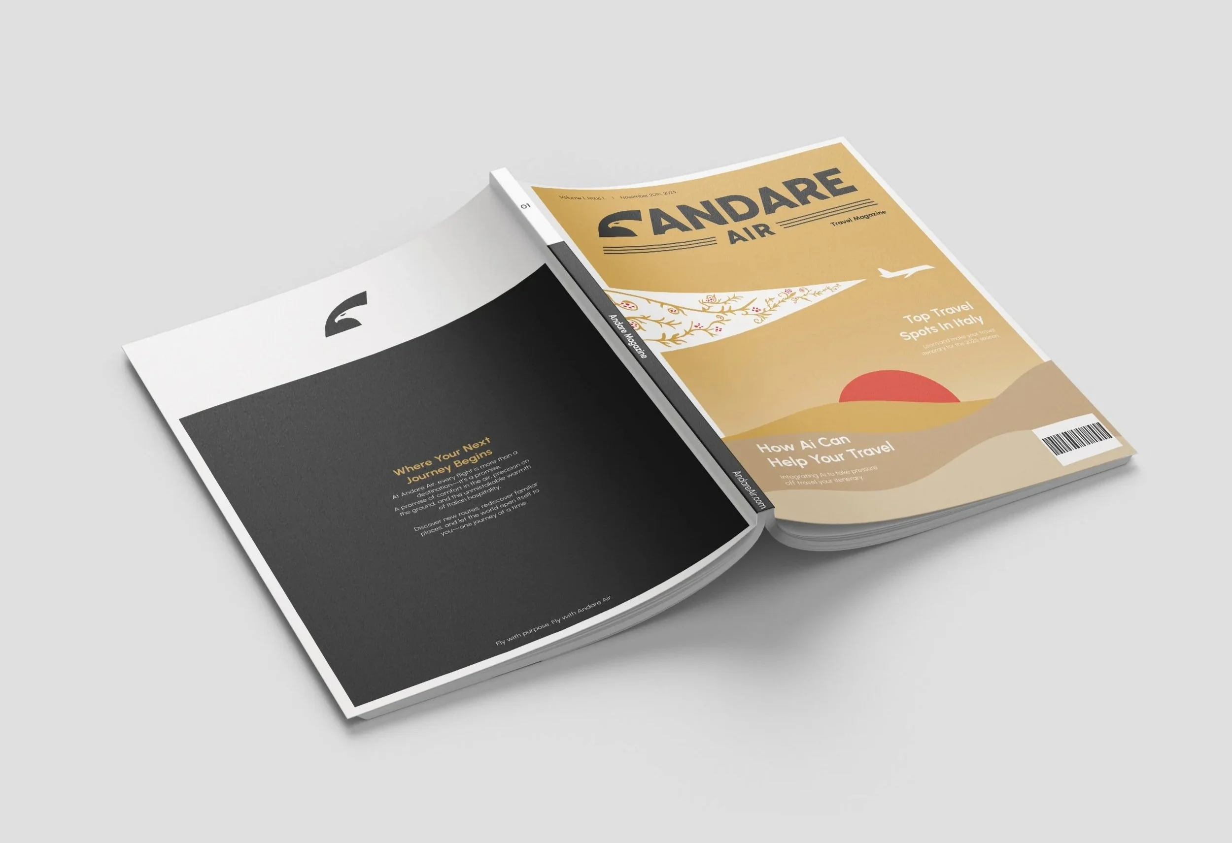
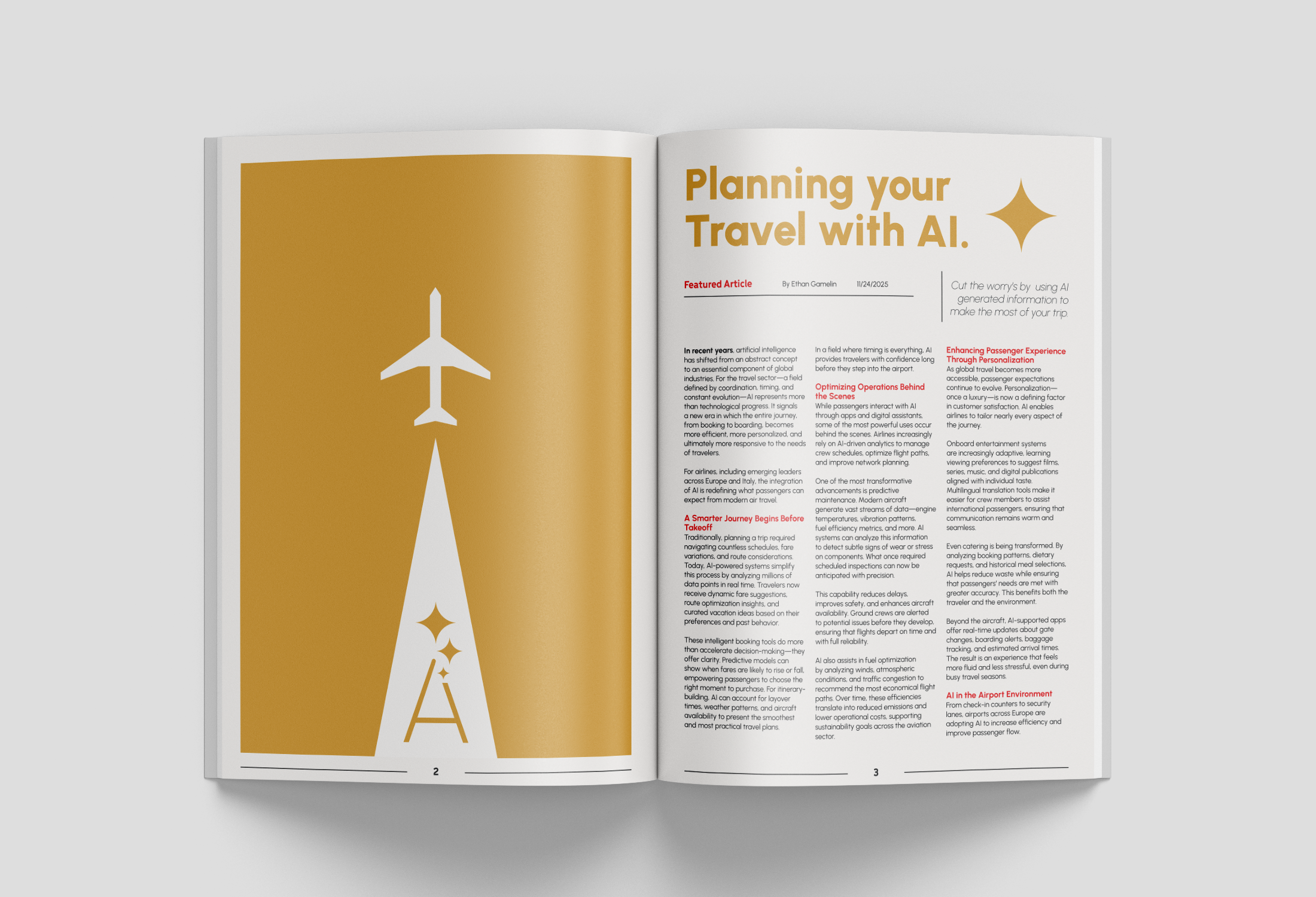
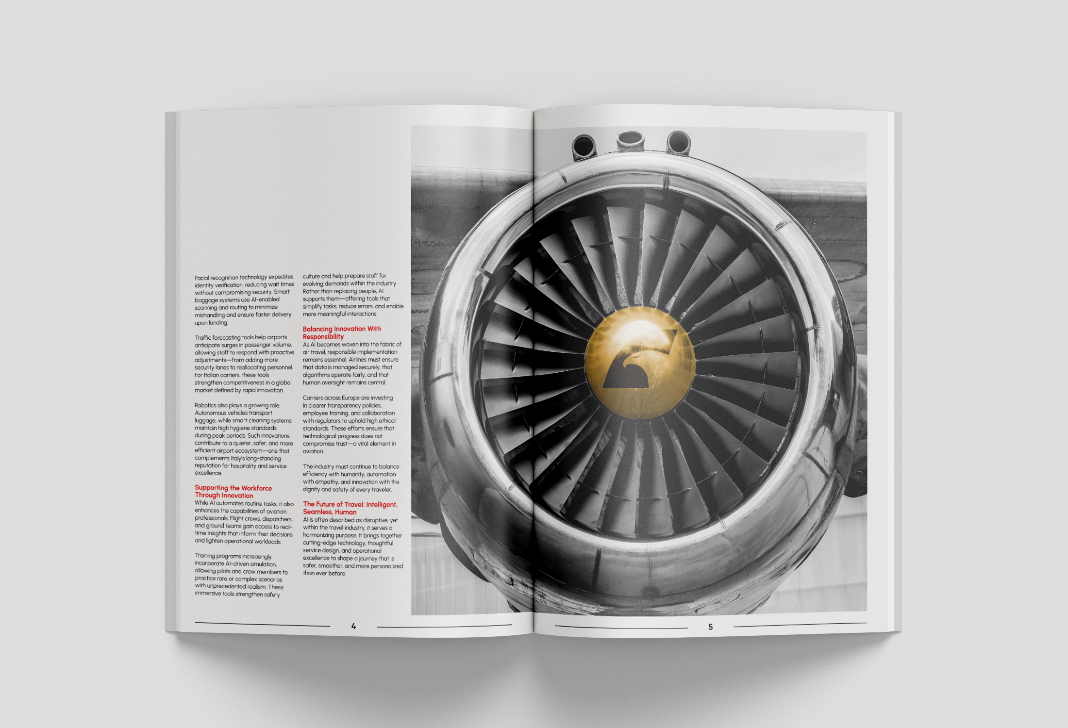
I wanted the in-flight magazines to feel modern and high-class, matching the rest of my branding. For the cover, I incorporated the illustrated airplane used throughout the rest of my designs, along with its ornamentation.
I use minimal layouts to make my spreads readable and capture attention. I brought in airplane illustrations and edited pictures to emphasize the design.
-
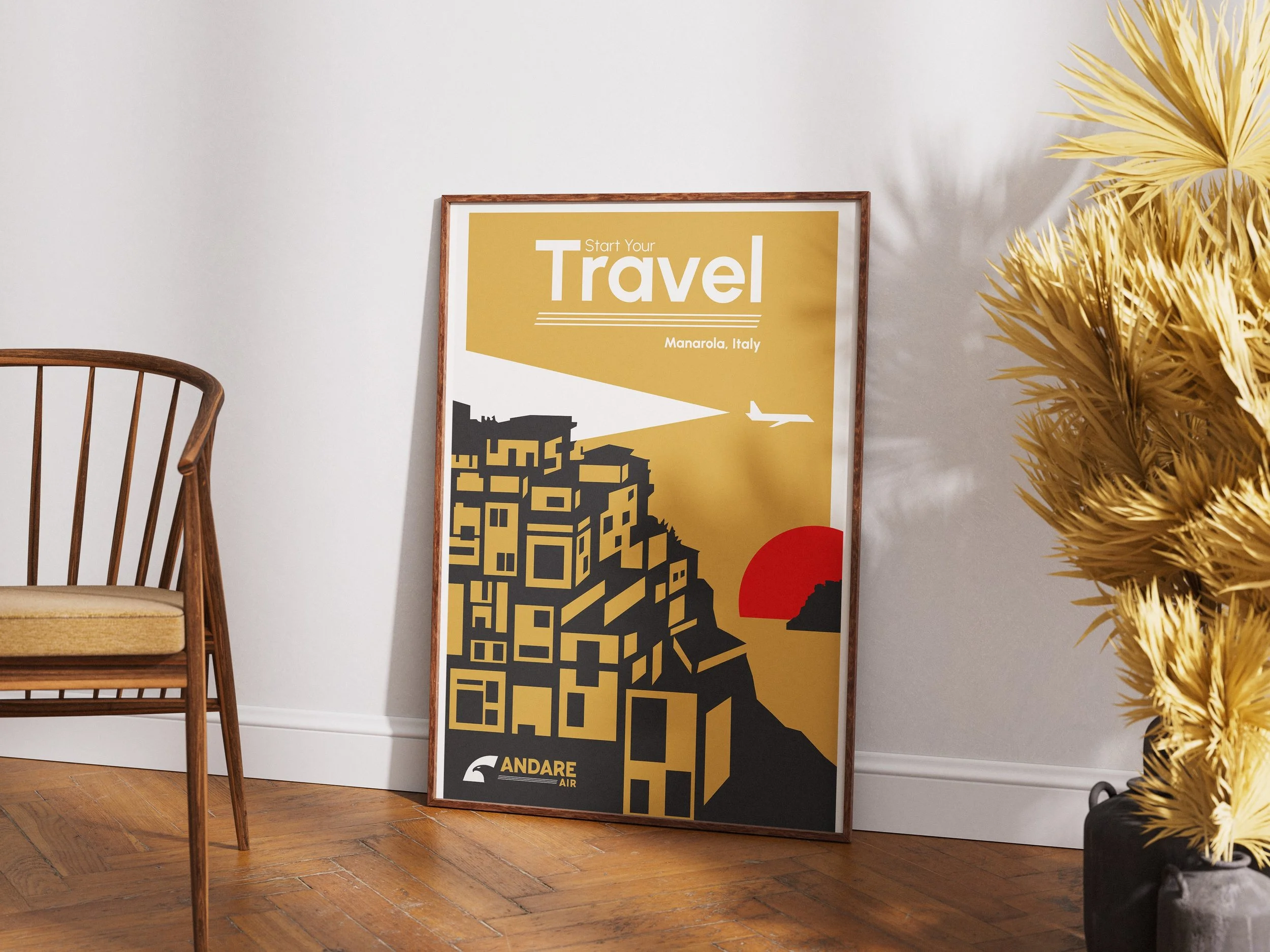
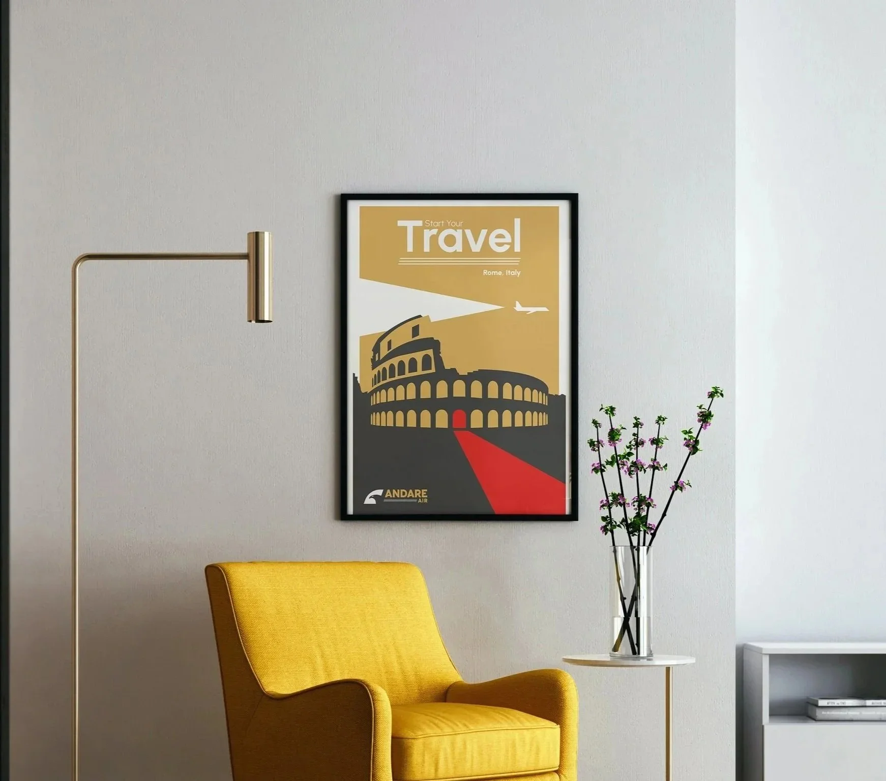
I incorporated key elements of my branding to create a cohesive two-series set of vintage travel posters. I wanted these posters to be something people would hang up in their houses.
The posters depict locations across Italy that inspire people to travel. I used geometric shapes and played around a lot with minimalist design.
-
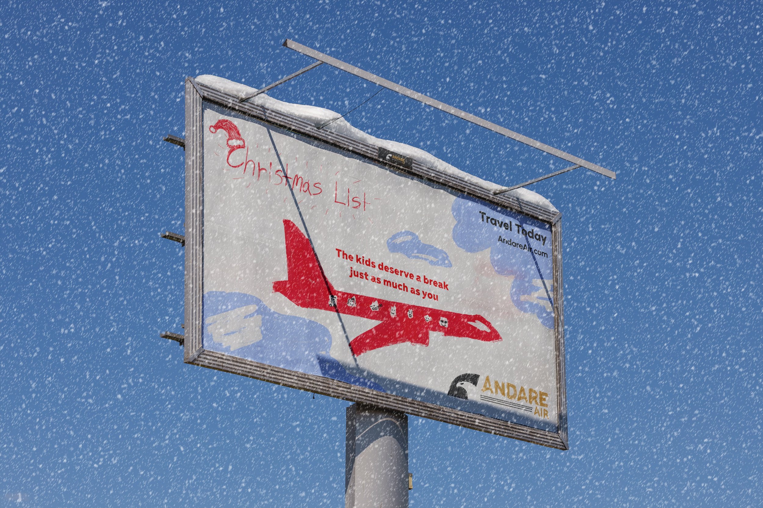
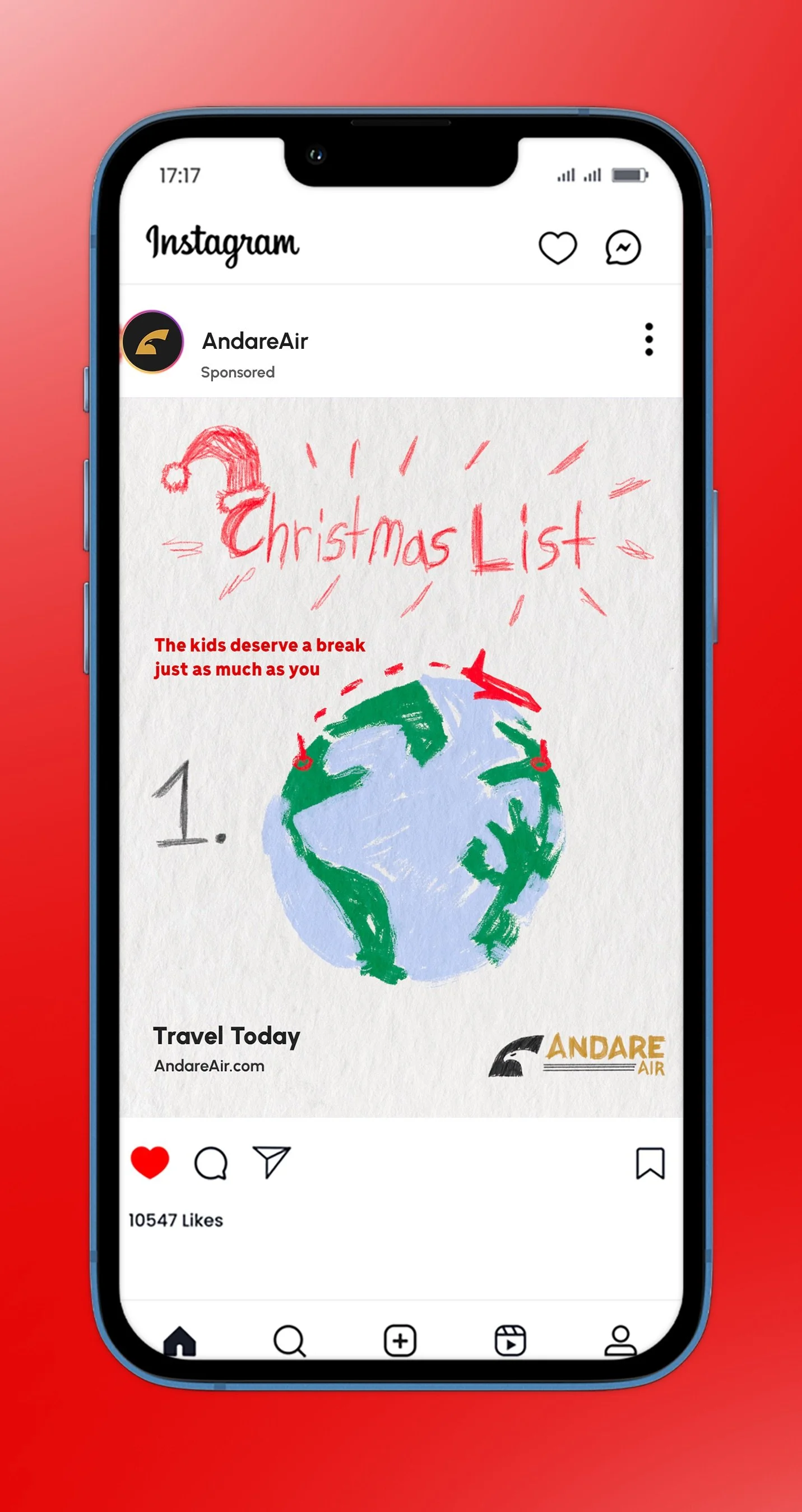
Because my posters focused less on advertising and would be sold as a commercial good, I wanted to create a Christmas Campaign. This is the first time I really get to show the diversity of my brand, playing around with tone and messaging.
The billboard and social media advertisements focus on kids writing their Christmas list. This ad would play mainly in the U.S.
Branding
Airline Livery
In Flight Magazine
Travel Posters
Social Campaign
Other Applications