Concert Branding
Overview
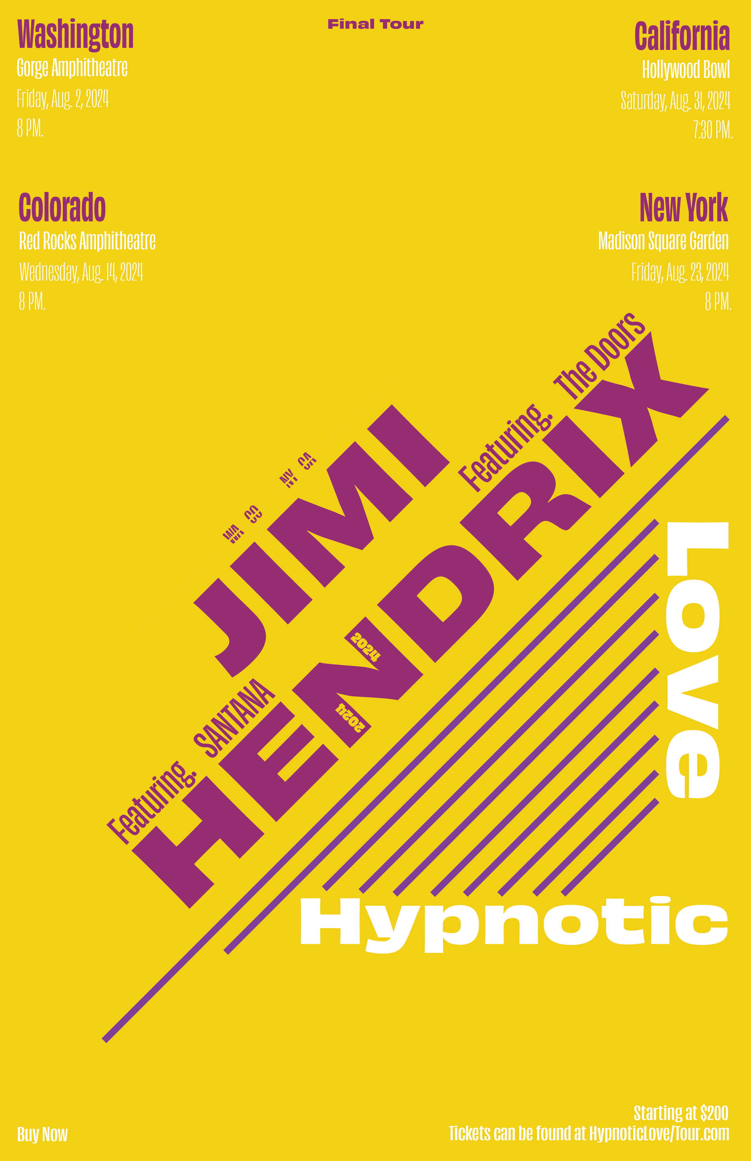
During freshman year, I created a Swiss Style concert poster for Jimi Hendrix. After winning an award at my school, I decided I wanted to create other deliverables around the project.
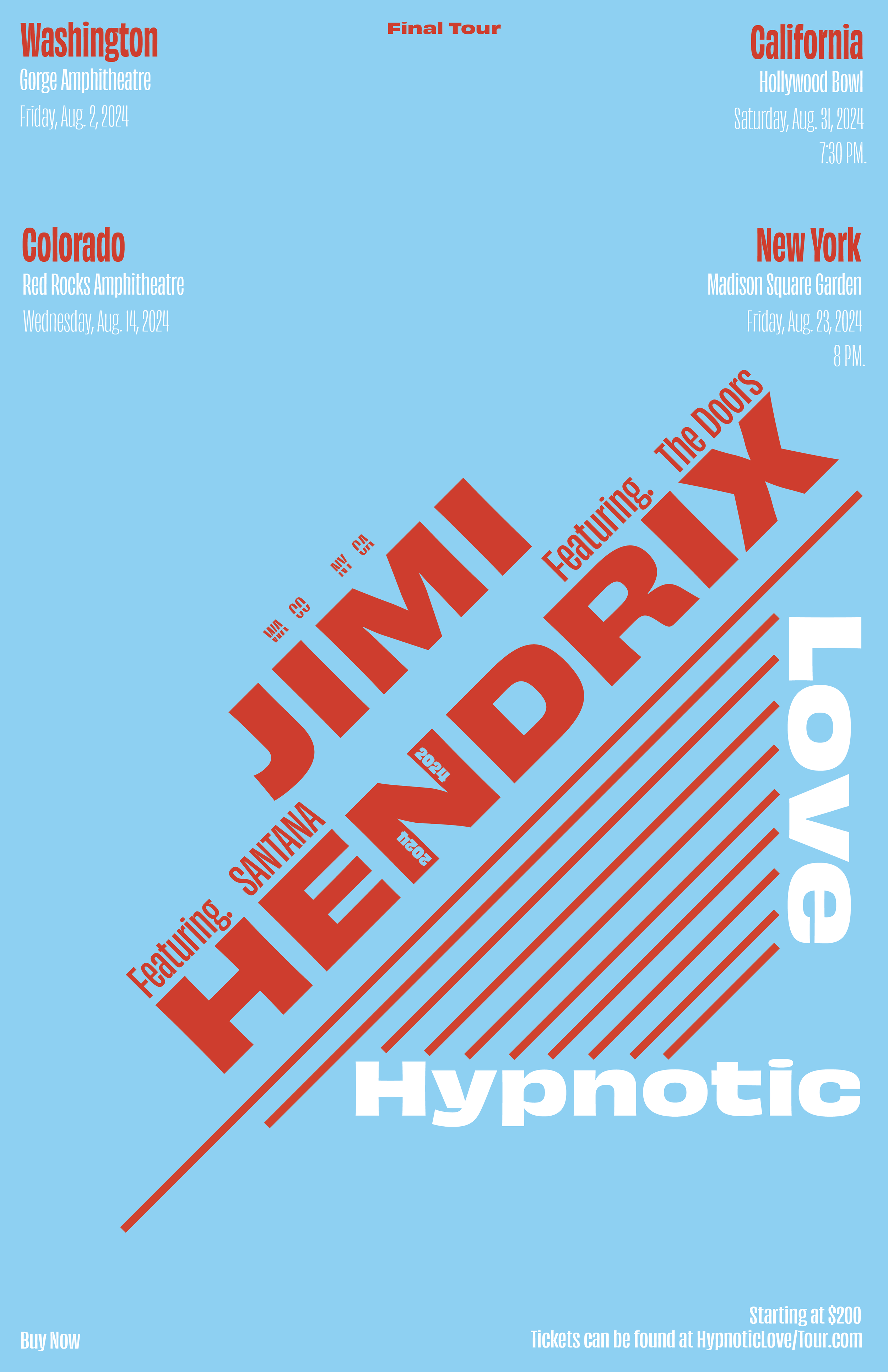
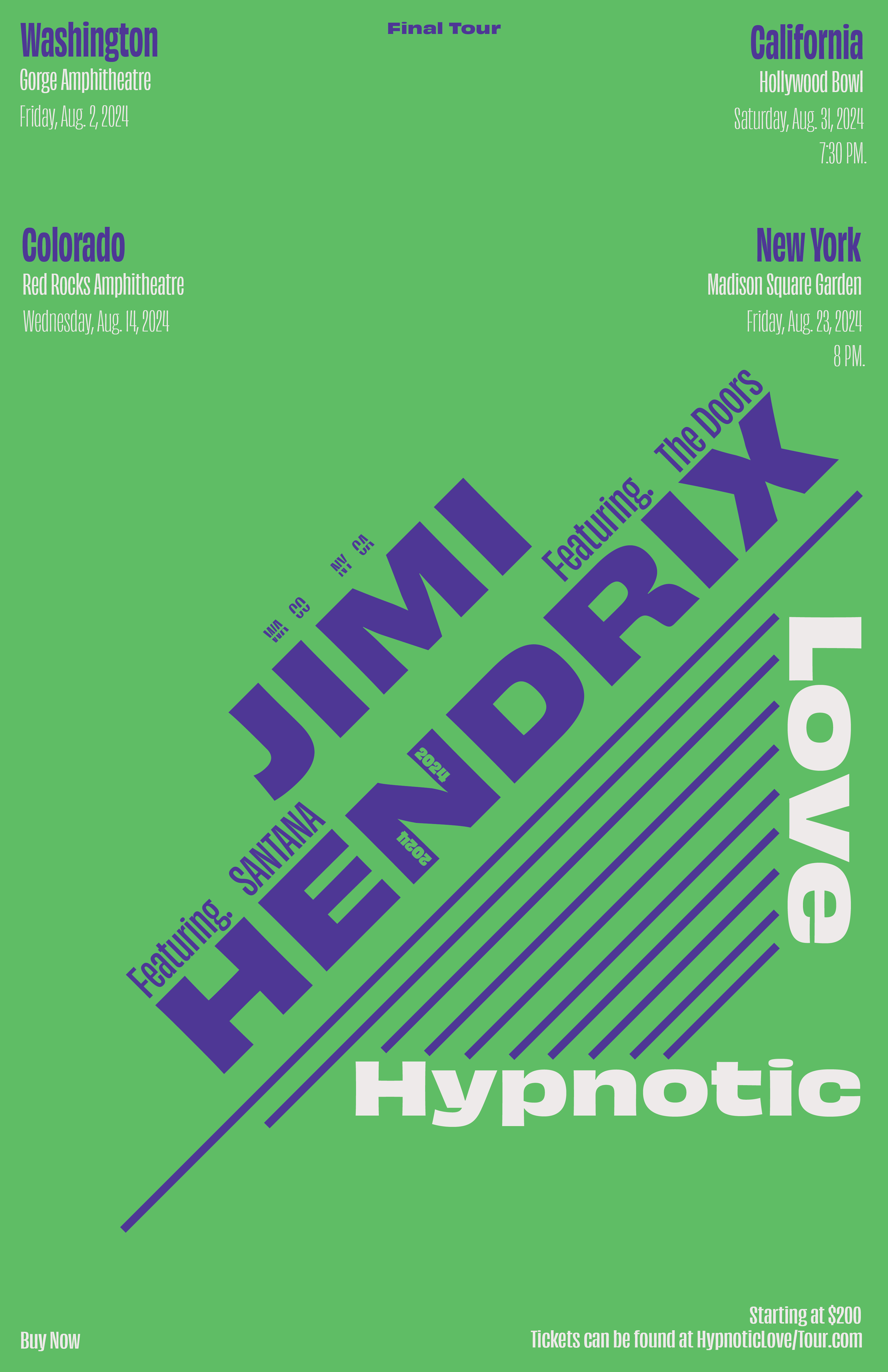
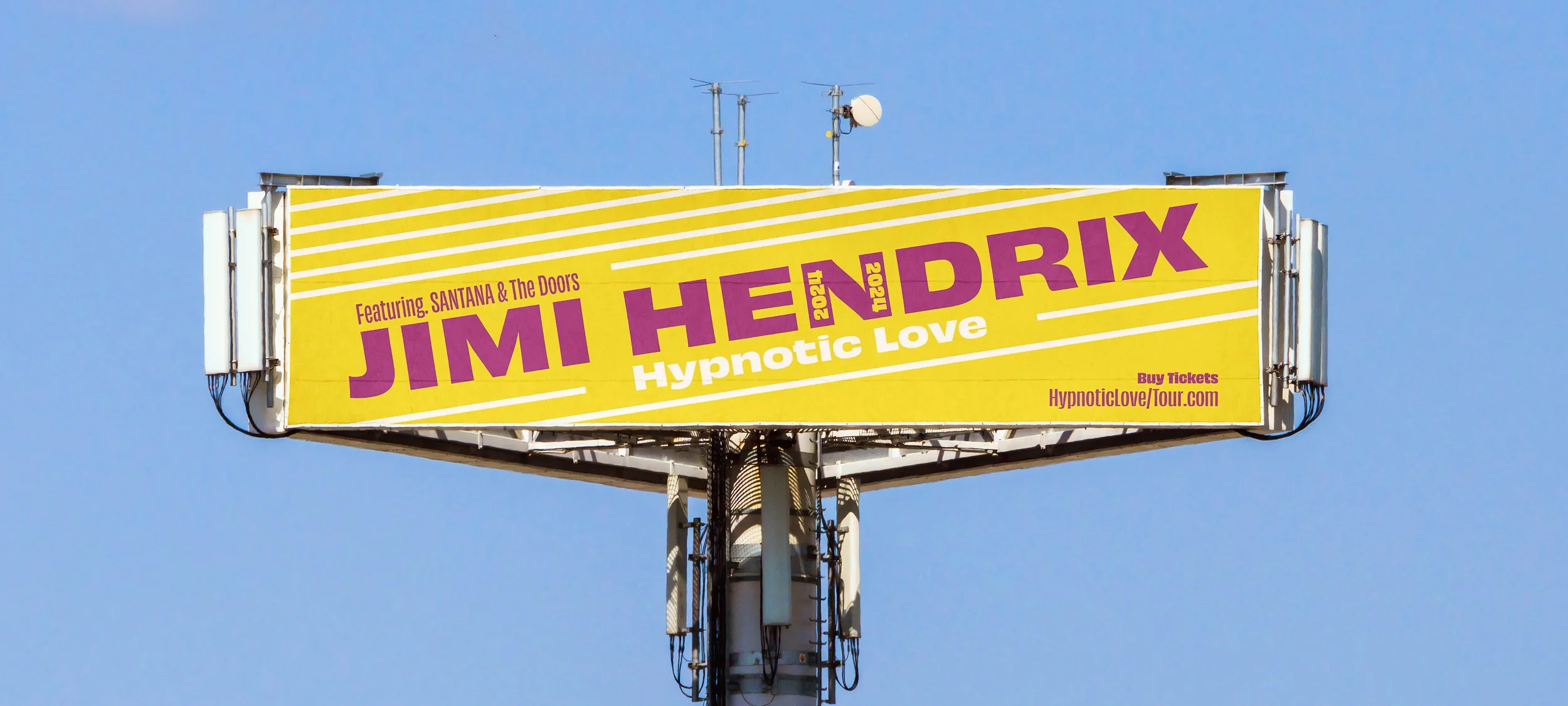
I went back to the drawing board and created a billboard advertisement and merchandise. The decision to choose yellow and purple for the branding reflects a time frame when bright psychedelic colors were being used by artists.
-
I created a Swiss-style poster. Its colors and layout were heavily influenced by past artists during the 70’s.
The poster emphasizes movement and hierarchy as it is able to lead the viewer's eye through the page.
-
I wanted to take all the things that worked from the poster and create advertisements that felt like they captured the same energy. I slightly titled angles of type and included only the most necessary copy.
I also wanted to challenge myself by choosing a very weirdly shaped billboard that also stood out due to its shape.
-
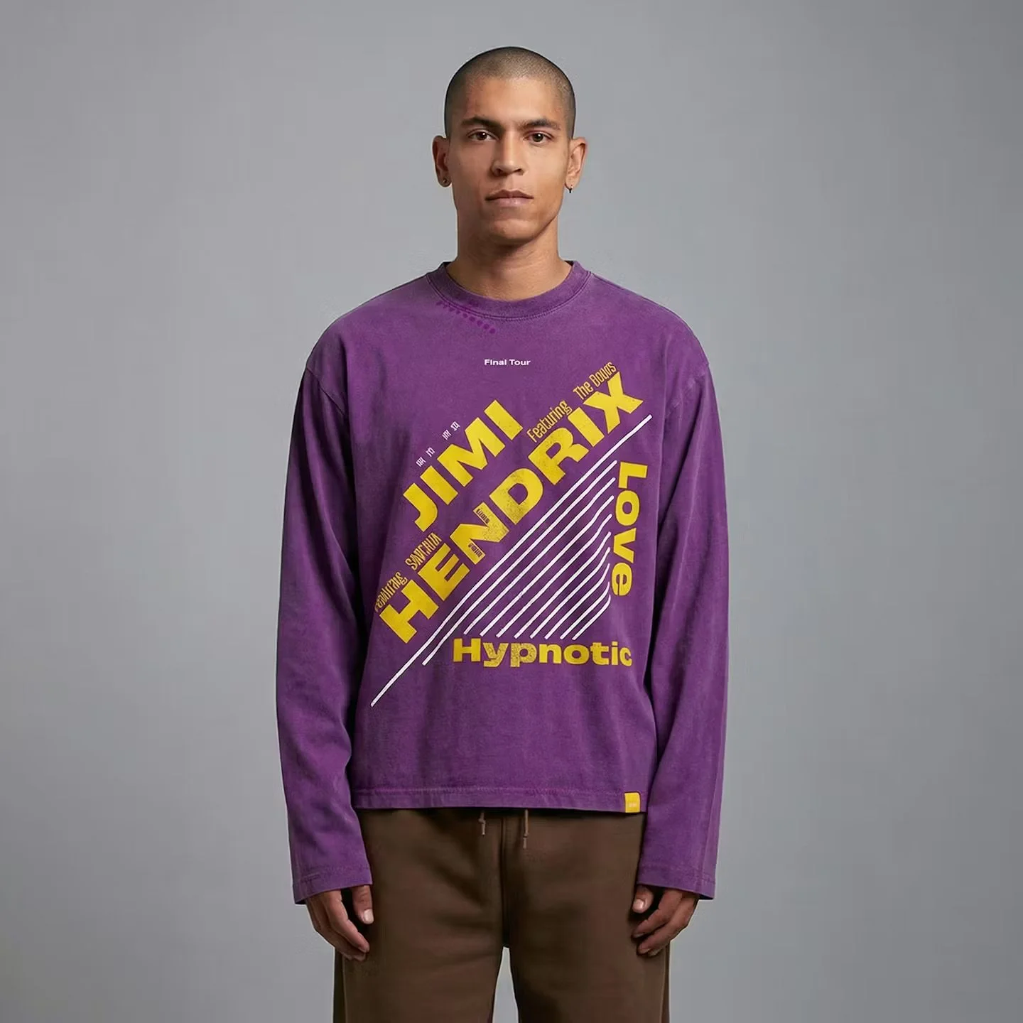
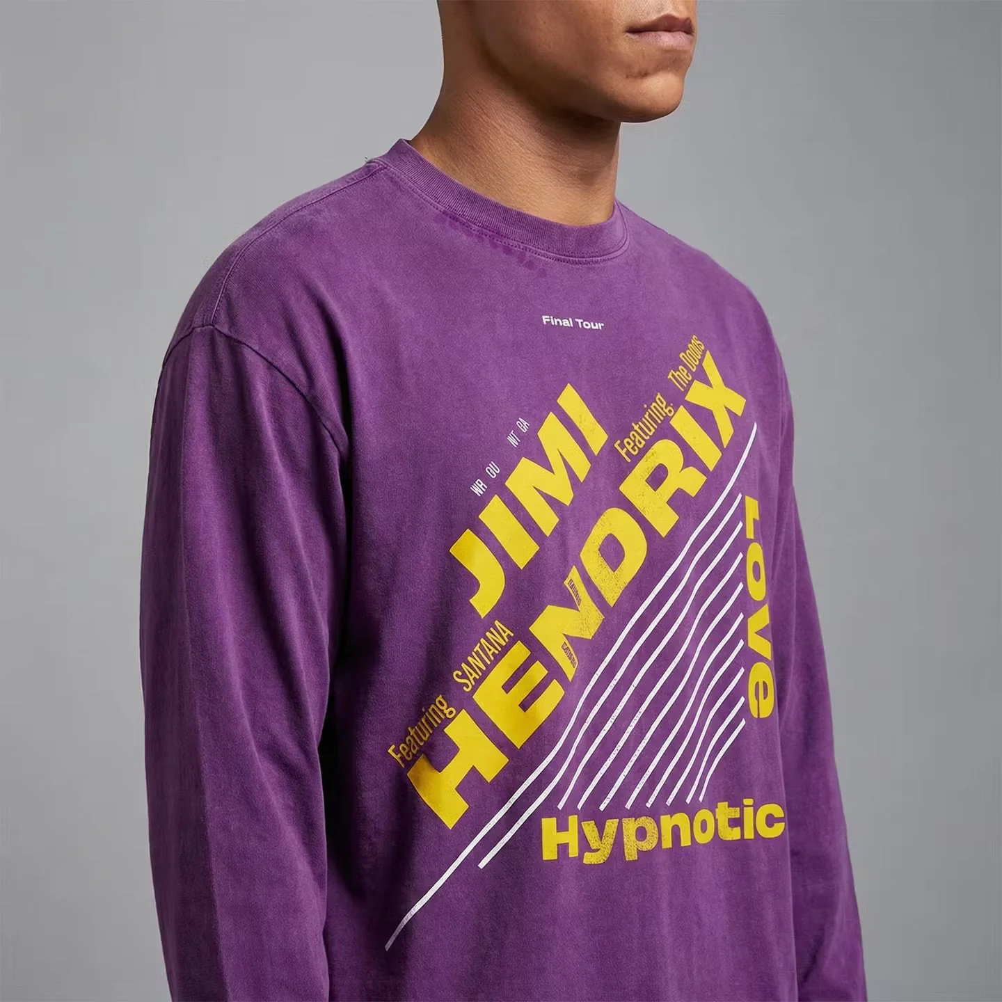
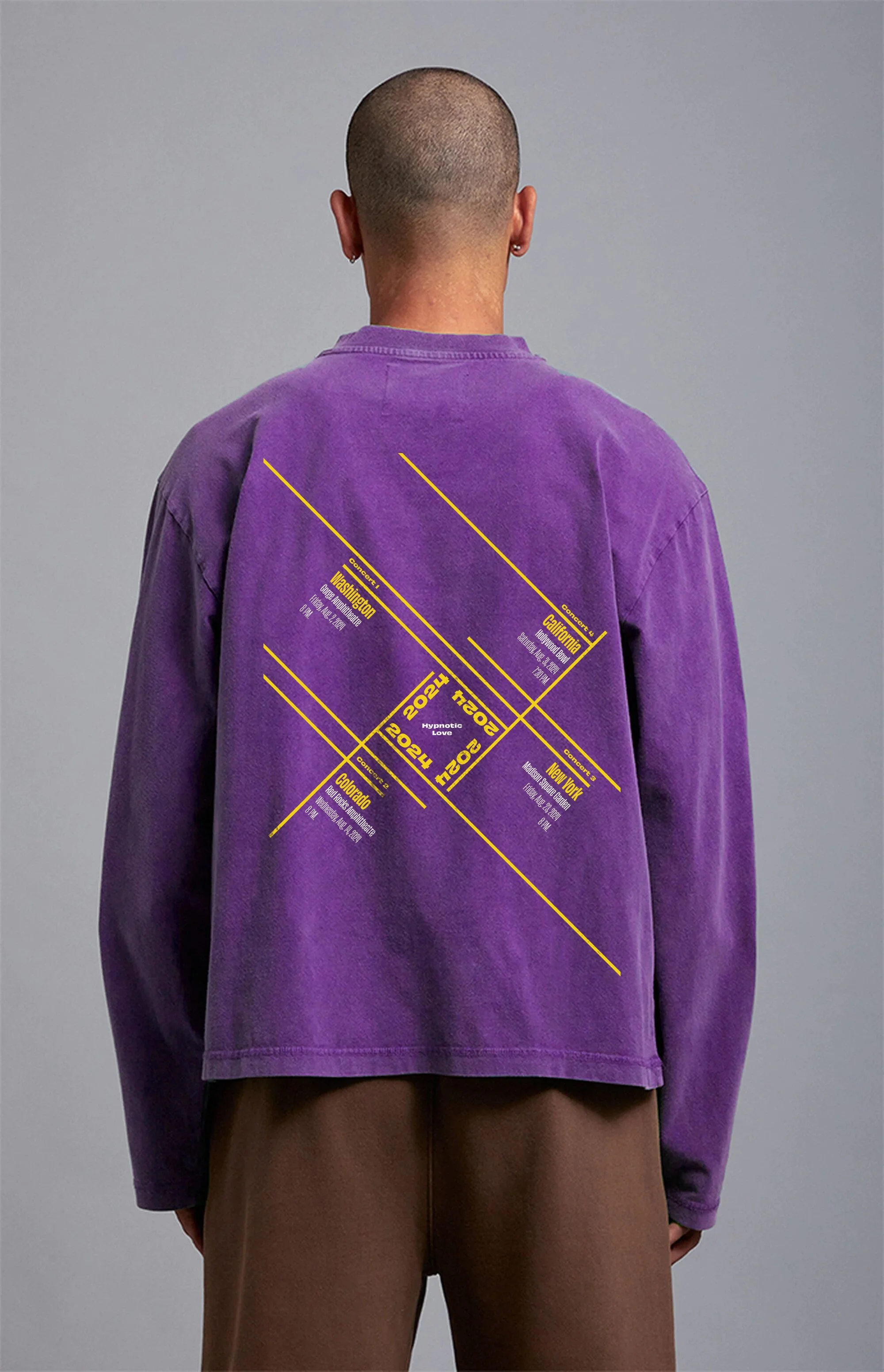
The main layout from the poster worked perfectly on the front of the t-shirt. I also wanted to create the back with all the shows. I paid careful attention to creating a dynamic composition, where each concert lived in its own space.
Poster Design
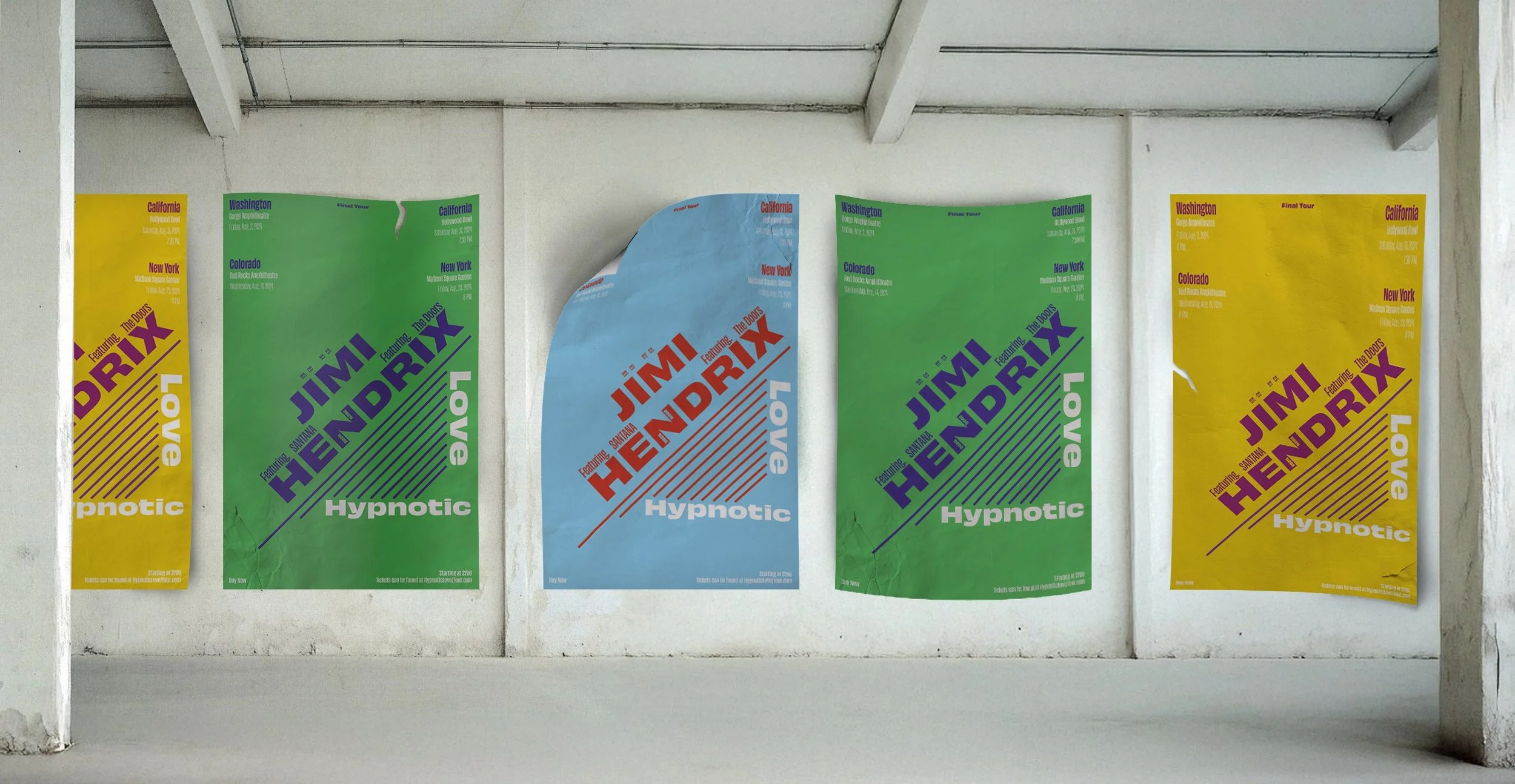
Billboard Ad
T-Shirt Merch